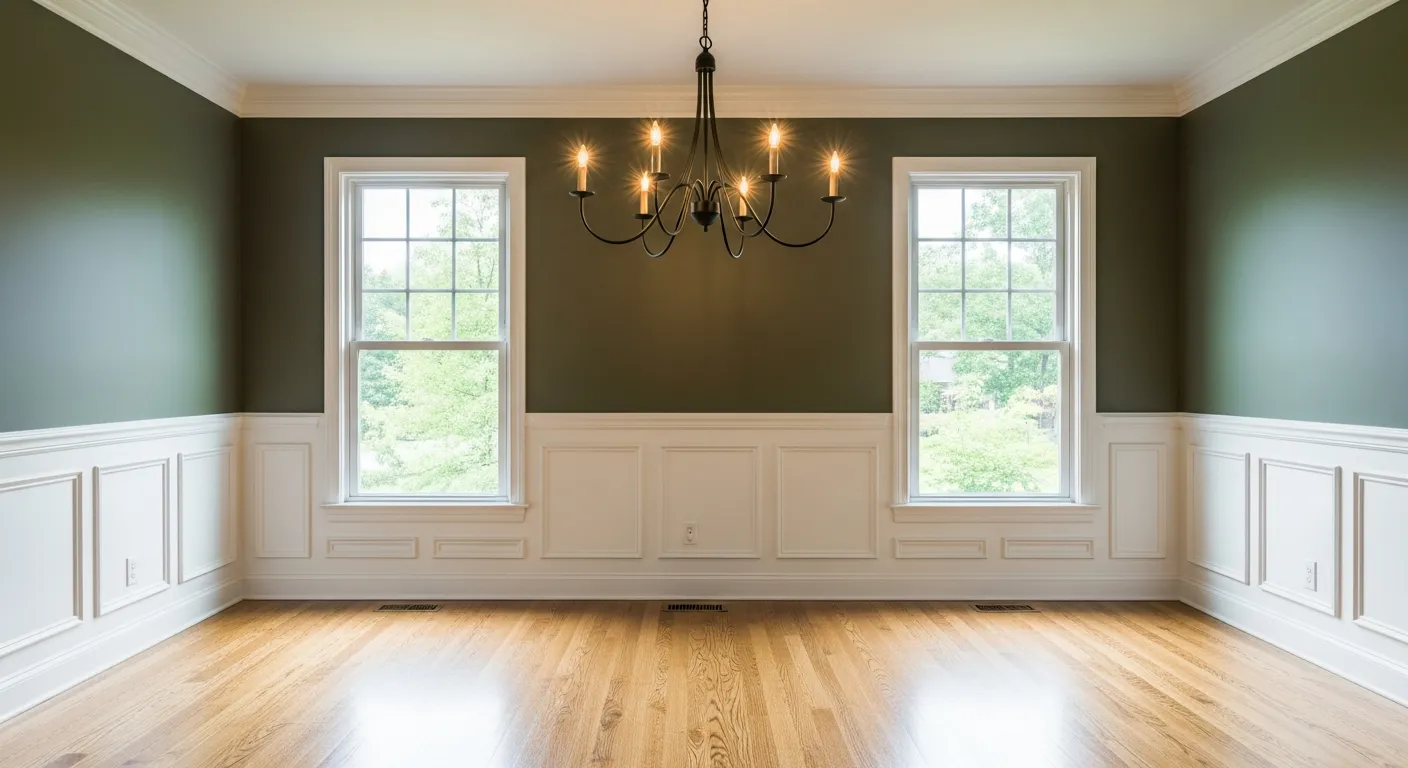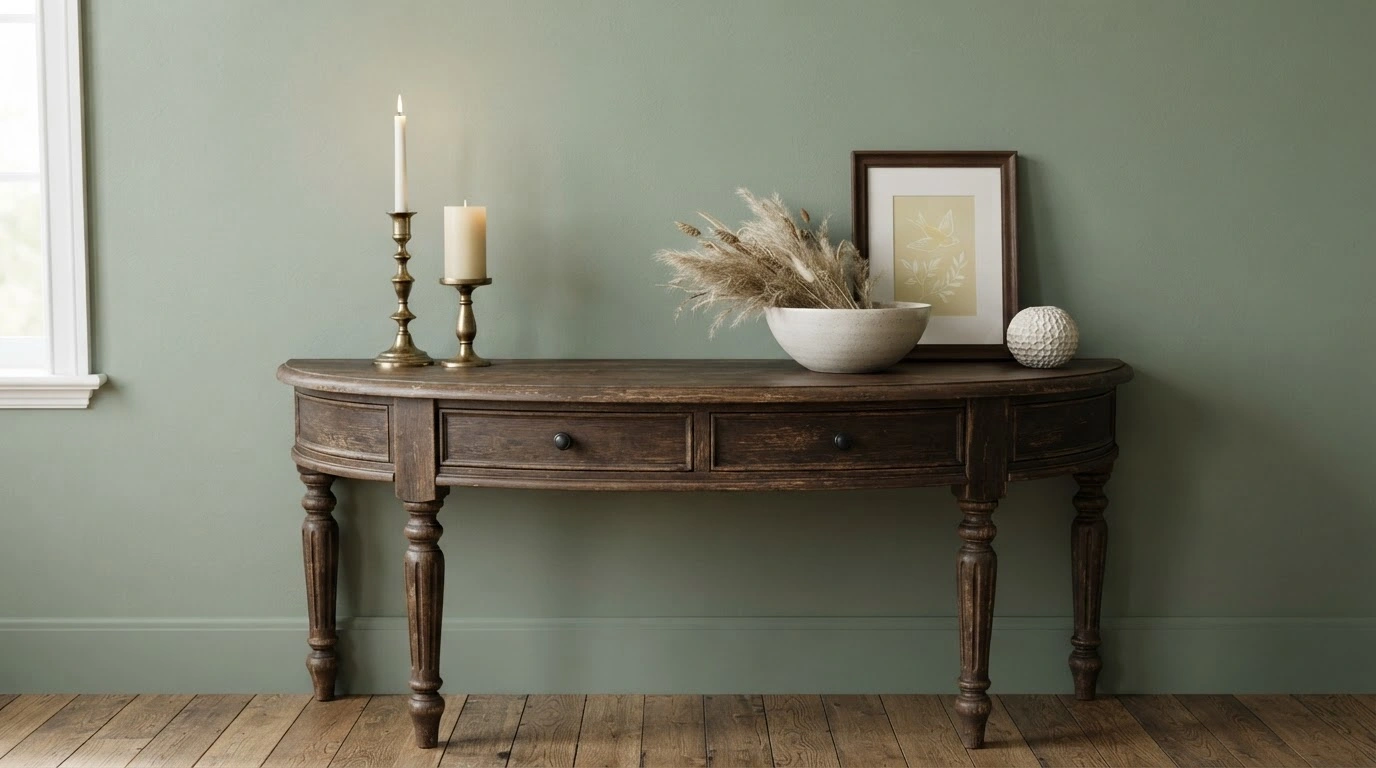
Sherwin Williams Parisian Patina SW 9041 changes the entire character of the room. The soft, subtle green brings calm and sophistication, making it an interesting choice for homeowners who want something beyond the usual whites, beiges, and greiges. Though it may look like a soft, dusty green, it changes color depending on the lighting.
The color is extremely versatile and that’s what makes it worth trying. However, before you use it, we recommend testing a sample. This blog explains everything you need to know about Sherwin-Williams Parisian Patina: where it can be used, its complementary and coordinating colors, and more.
What Color is Sherwin-Williams Parisian Patina?
Sherwin-Williams Parisian Patina SW 9041 is a muted mid-tone green with a subtle gray undertone and leans toward a light, cool tone. The color is neither too dark nor too light, which makes it perfect . The green isn't very strong or vivid, and a hint of gray tones it down further. So, it feels more muted and luxurious.
In natural light, the dusty, muted green is more noticeable, and under warmer bulbs, the artificial lighting can make the color look softer, warmer, and slightly less prominent.
You can pair the Parisian Patina with white trim, pale oak, aged brass, or matte black hardware as an accent. You can also pair it with white or creamy neutrals, and natural stone can complement the color well.
Sherwin-Williams Parisian Patina Undertones
SW9041 Parisian Patina adds a soft, romantic edge to an otherwise neutral palette. It has cool blue undertones paired with soft gray notes.
Where Does Parisian Patina Work Best?
Sherwin-Williams Parisian Patina works in every room.
Bedroom
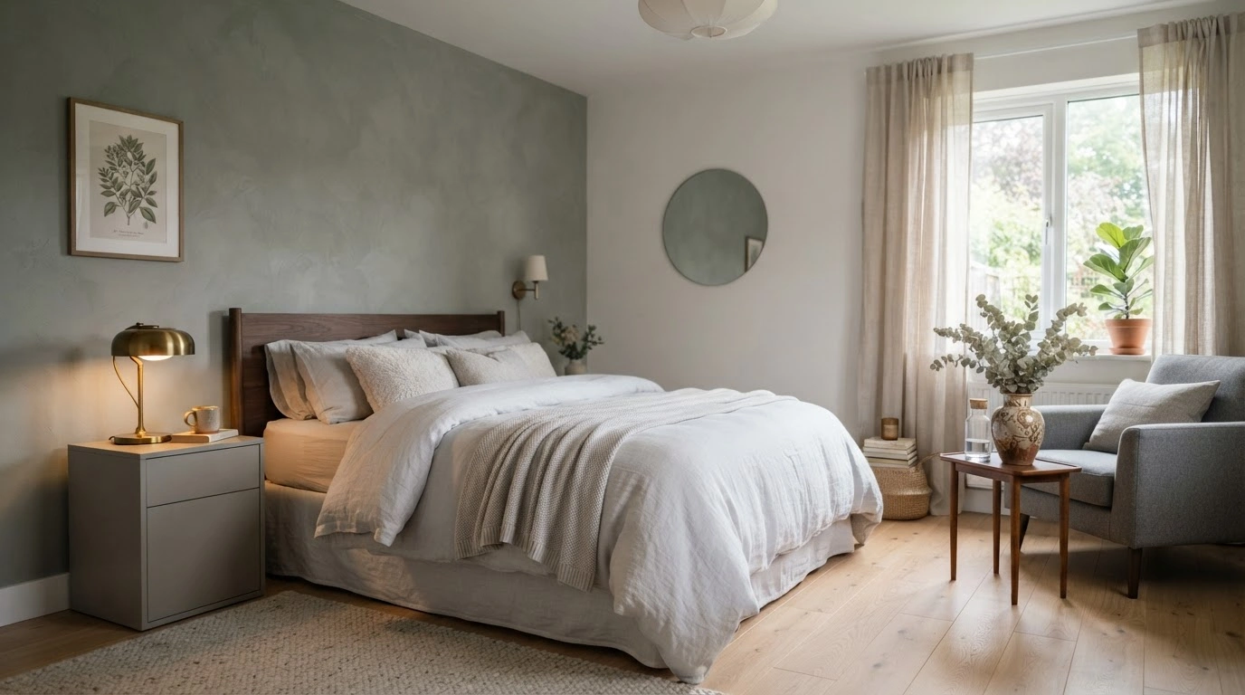
The muted green-gray tone brings a calm and cozy feel to the space. Painting a focus wall with SW Parisian Patina and the rest of the walls a neutral color, such as white, while keeping the bedding in gray-white, can make the room feel lively and eye-catching. Add gray furniture, linen curtains, and wood accents, plus a few vintage decor pieces to complete the look.
Living Room
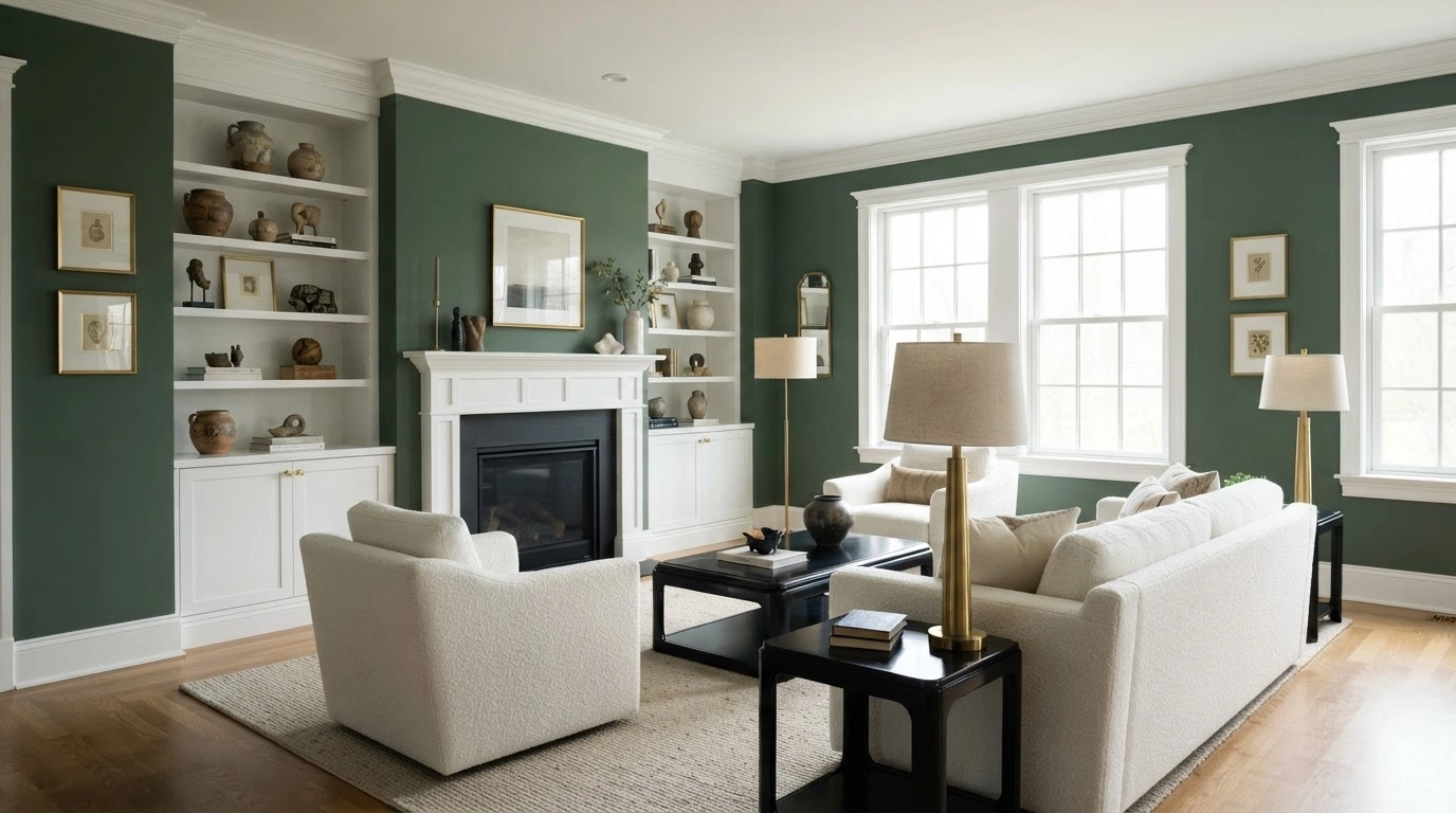
Parisian Patina by Sherwin-Williams looks really great in a white living room. Paint all the walls Parisian Patina, and paint the trim and fireplace white. Paint the window frames white, and incorporate white cabinets and built-in shelves along with white furniture and black tables.
Add some metal accents, such as brass lamps or picture frames. These details work well with SW Parisian Patina and don't steal attention from the green walls.
Kitchen
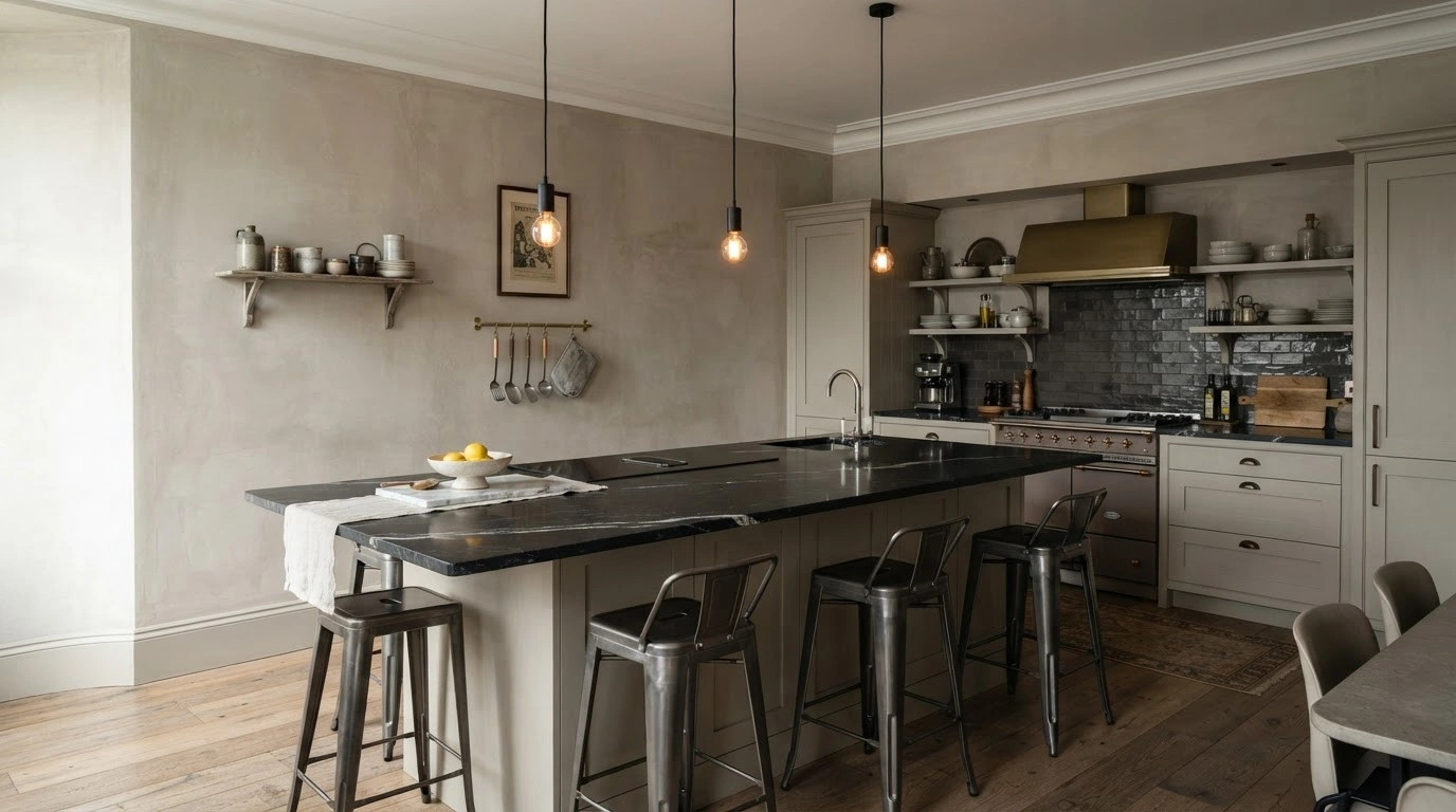
You can use Parisian Patina on the kitchen walls while keeping everything else neutral. Add accent pieces with a black countertop, metal chairs, and a few hanging lights. Keep the ceiling and the trim neutral, too.
Bathroom
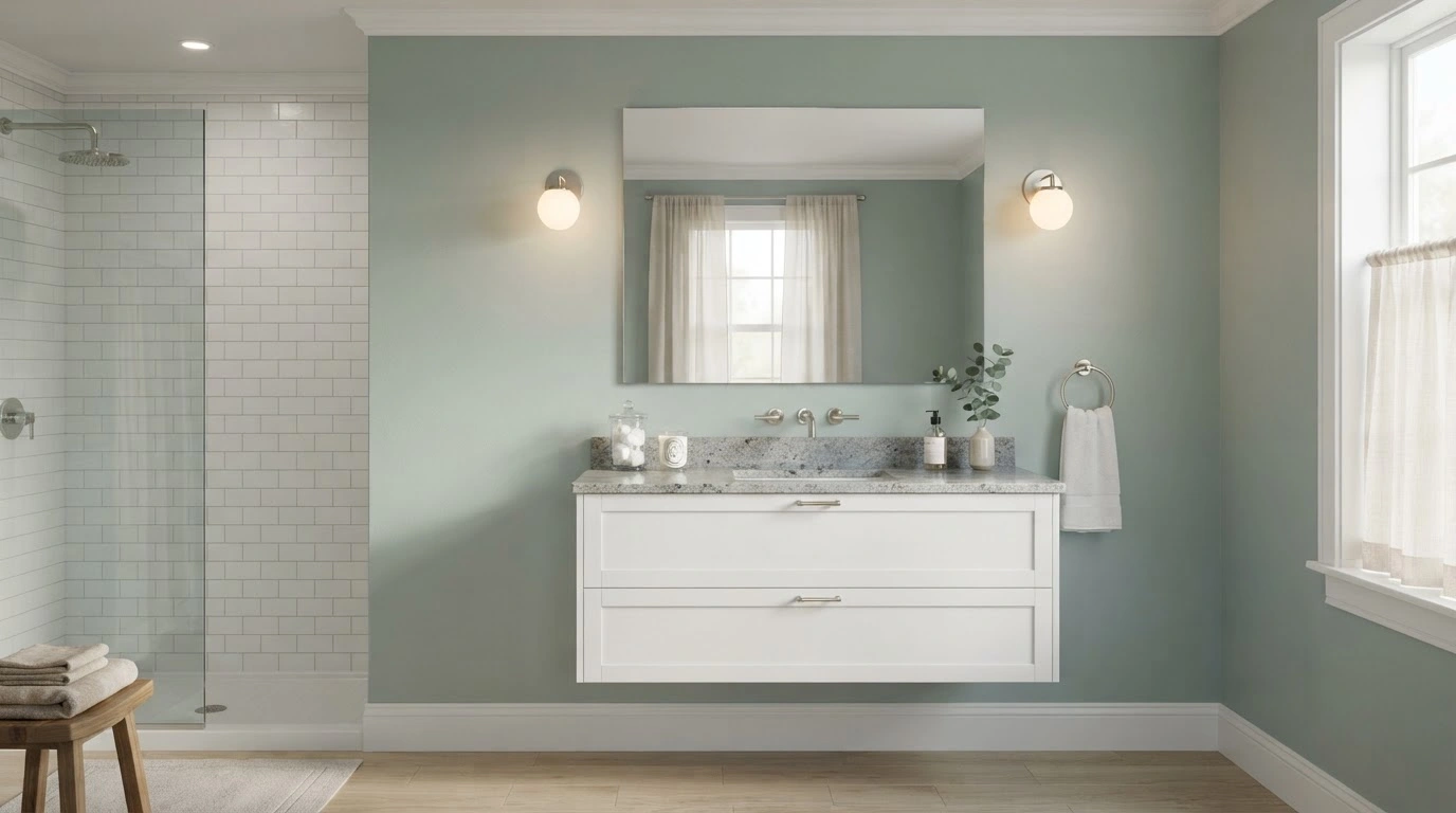
The soft, muted green with the gray-blue undertones of Parisian Patina by Sherwin-Williams creates a spa-like backdrop that highlights the room’s lighter architectural features without overpowering them.
The color frames the trims beautifully, creating clean-lined borders that help the green paint stand out. You can add a granite countertop with white vanity cabinets, plus a wall-mounted mirror and warm light sconces over it for a soft glow.
Exterior
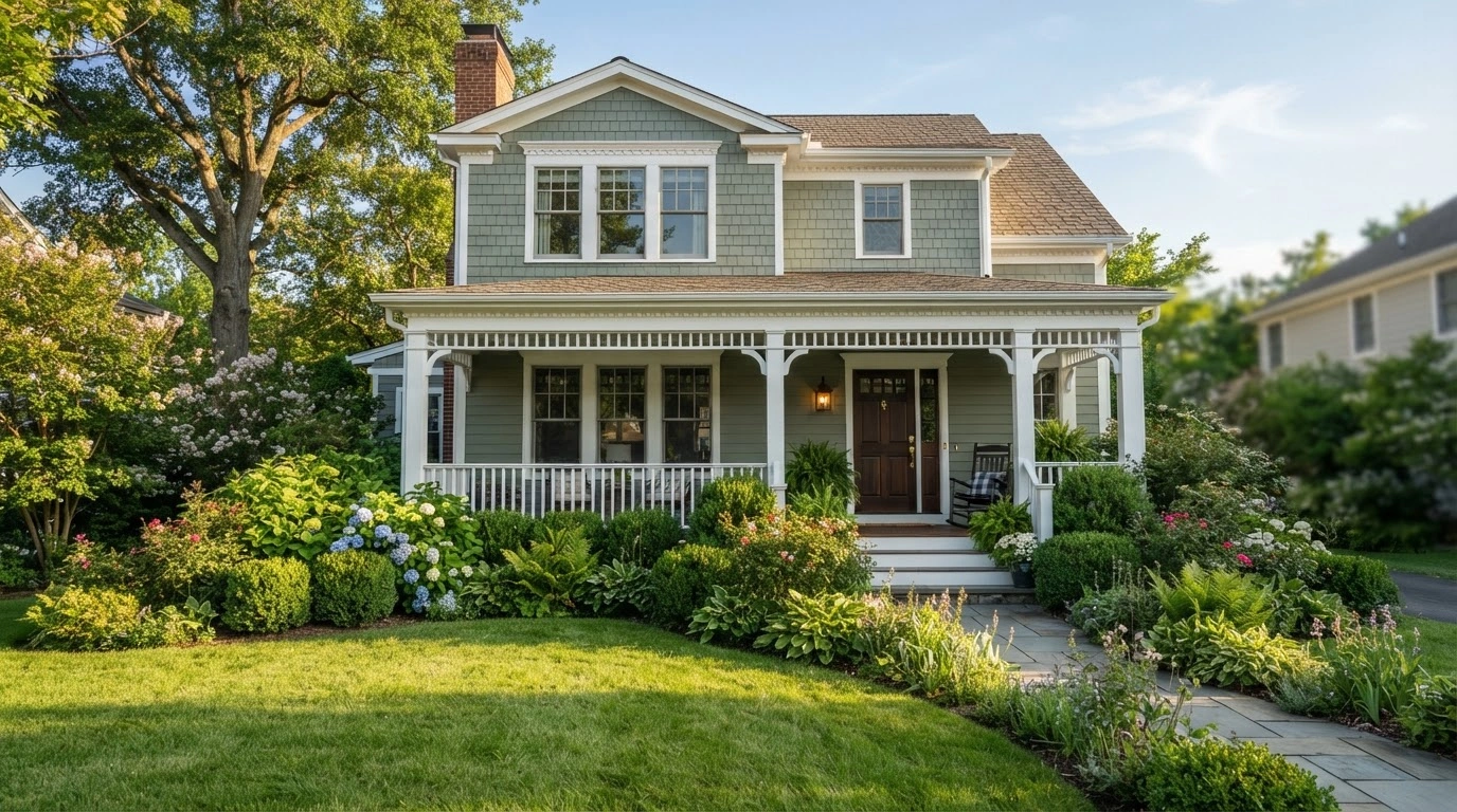
Parisian Patina SW also looks good on the exterior of the home, if you add neutrals or crisp white as complementing colors. The muted green perfectly pairs well with the greenery in the yard, making your home look beautiful.
Best Coordinating Colors for Sherwin-Williams Parisian Patina
Here are three colors that can be deemed best coordinating colors for Sherwin-Williams Parisian Patina -
- SW6455 Fleeting Green
- SW7626 Zurich White
- SW7060 Attitude Gray
Best Monochromatic Colors for Sherwin-Williams Parisian Patina
A monochromatic color scheme works well with Sherwin-Williams Parisian Patina. This color scheme includes various shades, tones, and tints of a single color. When using coordinating colors, introduce them with accent decor; otherwise, it may look monotonous. Some of the colors are -
Lighter Shades
- 6213 Halcyon Green
- SW6212 Quietude
- SW9659 Marine
- SW 9658 Fresh Eucalyptus
- SW6457 Kind Green
Darker Shades
- SW6459 Jadite
- SW6466 Grandview
Best Complementary Colors for Sherwin-Williams Parisian Patina
This color scheme combines two shades opposite each other on the color wheel. The strong contrast creates a vibrant, dynamic visual effect. Parisian Patina has a yellowish hue, so colors with a purple undertone can complement it.
Consider colors close to 324 degrees on the color wheel, such as Sherwin-Williams Whimsical White and Radiant Lilac. Colors that work as complementary colors are -
- SW6826 Whimsical White
- SW0074 Radiant Lilac
- SW9076 Ruby Violet
- SW6284 Plum Dandy
- SW6283 Thistle
- SW6281 Wallflower
- SW6282 Mauve Finery
Which Other Brand Colors Look Similar to Sherwin Williams' Parisian Patina?
Here are some colors that look almost similar to Sherwin-Williams’ Parisian Patina -
- BEHR Mossy Bench
- Sherwin-Williams Verdigreen
- Benjamin Moore Parsley Snips
- PPG Slate Green
- Valspar Brimming Over
- Dunn Edwards Mother Earth
- Magnolia Home Spontaneous
- Farrow & Ball Chappell Green
- Clark+Kensington Basil Leaf
- Dutch Boy Backwoods Green
- Glidden Luscious Moss
Remember, these may not be exact matches. So, before using these paints, always test them on the walls to see how they look under different lighting and at different times of day.
How Lighting Affects Parisian Patina?
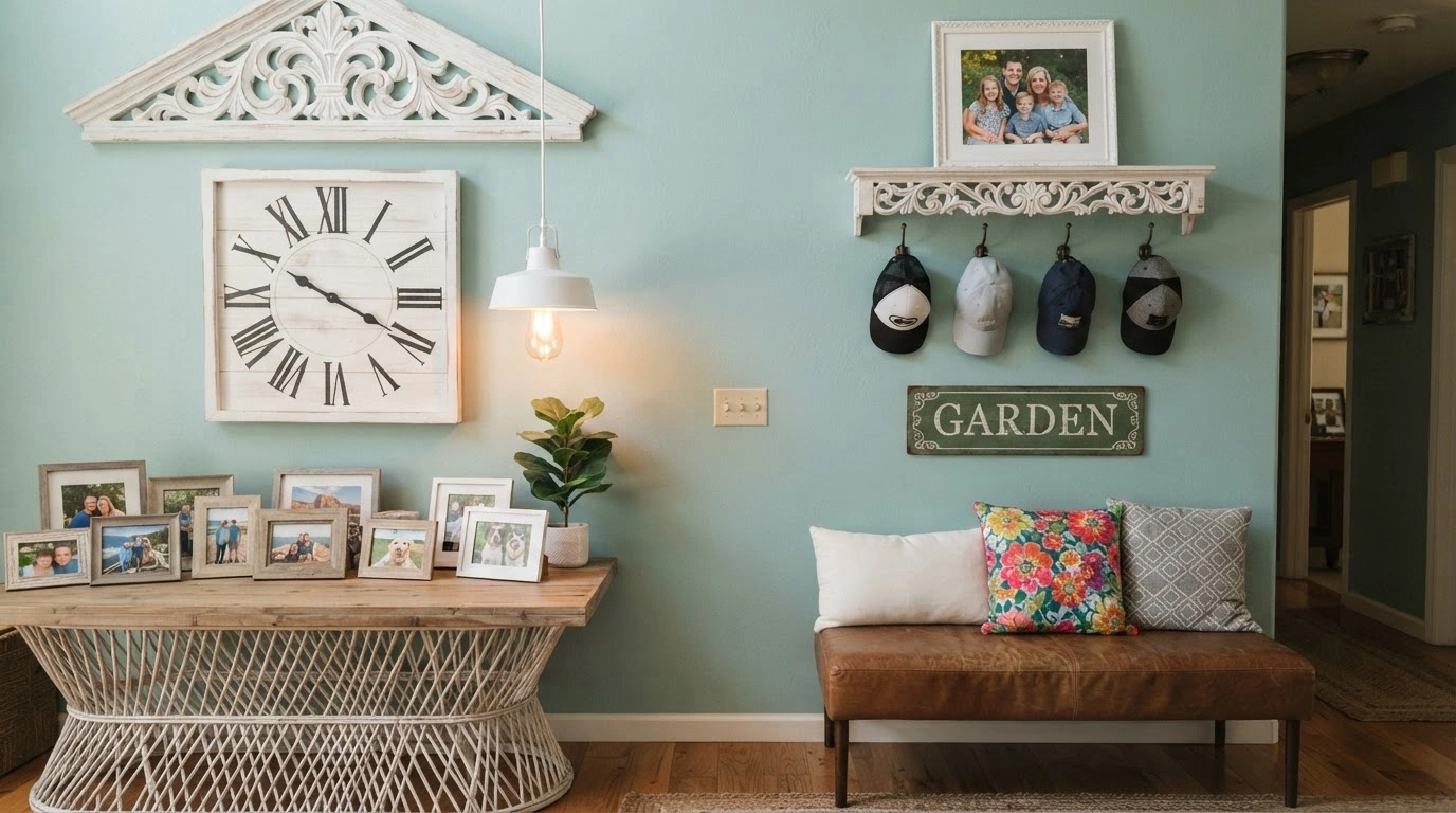
Lighting can change how the Parisian Patina on your wall will look throughout the day. Under warm artificial light, the ambiance might look softer and earthier, bringing out slight yellow undertones. On the other hand, under cool light, the interior may look fresher and more muted, with slightly blue-green undertones. In natural light, the color may shift depending on the time of day and the room's direction.
Natural Light
The color doesn't stay the same throughout the day, as its color temperature varies with the time.
- Sunrise and Sunset: Around 2,000K, which makes the surrounding look warm, golden, orange, or reddish.
- Around Noon: 5,500-6,500 K, making the room look cooler, brighter, and more neutral or bluish.
Natural light-temperature also depends on its direction, as explained in the table below -
| Direction of Sunlight | Visible Temperature | Hue | Duration |
| North | Cool | Bluish | Throughout the Day |
| East | Warm | Yellow | Before Noon |
| West | Warm | Orange-Red | Afternoon |
| South | Warm | Orange-Yellow | Throughout the Day |
Artificial Lighting
When choosing artificial light for your home, check the color temperature (Kelvins). This is because different temperatures shift the room's color from warmer to cooler. For example, a 2000K bulb will make the ambiance warmer and cozier. For a cozier feel, choose a bulb above 4000K and move toward 6000-7000K; your home will look bluer and cooler.
Conclusion
Sherwin Williams Parisian Patina (SW9041) adds character without feeling heavy or overwhelming. The color is soft and nature-inspired, which works with almost all decorating styles, whether it’s contemporary, traditional, or relaxed modern. The color is flexible so that you can use it on the main wall, kitchen cabinets, bathroom walls, and even outdoors. However, because paint rarely looks the same in every home, factors such as room size, surrounding colors, furnishings, and natural light can influence how the shade looks on your wall.