Are you looking for a subtle shade that still brings elegance to your interiors? The pale shade Opaline by Sherwin-Williams is one such unique option that adapts well to various lighting conditions and decor styles. While the shade may seem simple, it pairs well with a wide range of colors. Because of its versatility, it's an excellent choice for different rooms in your house, from your living room to your kitchen.
What Color is Sherwin Williams Opaline?
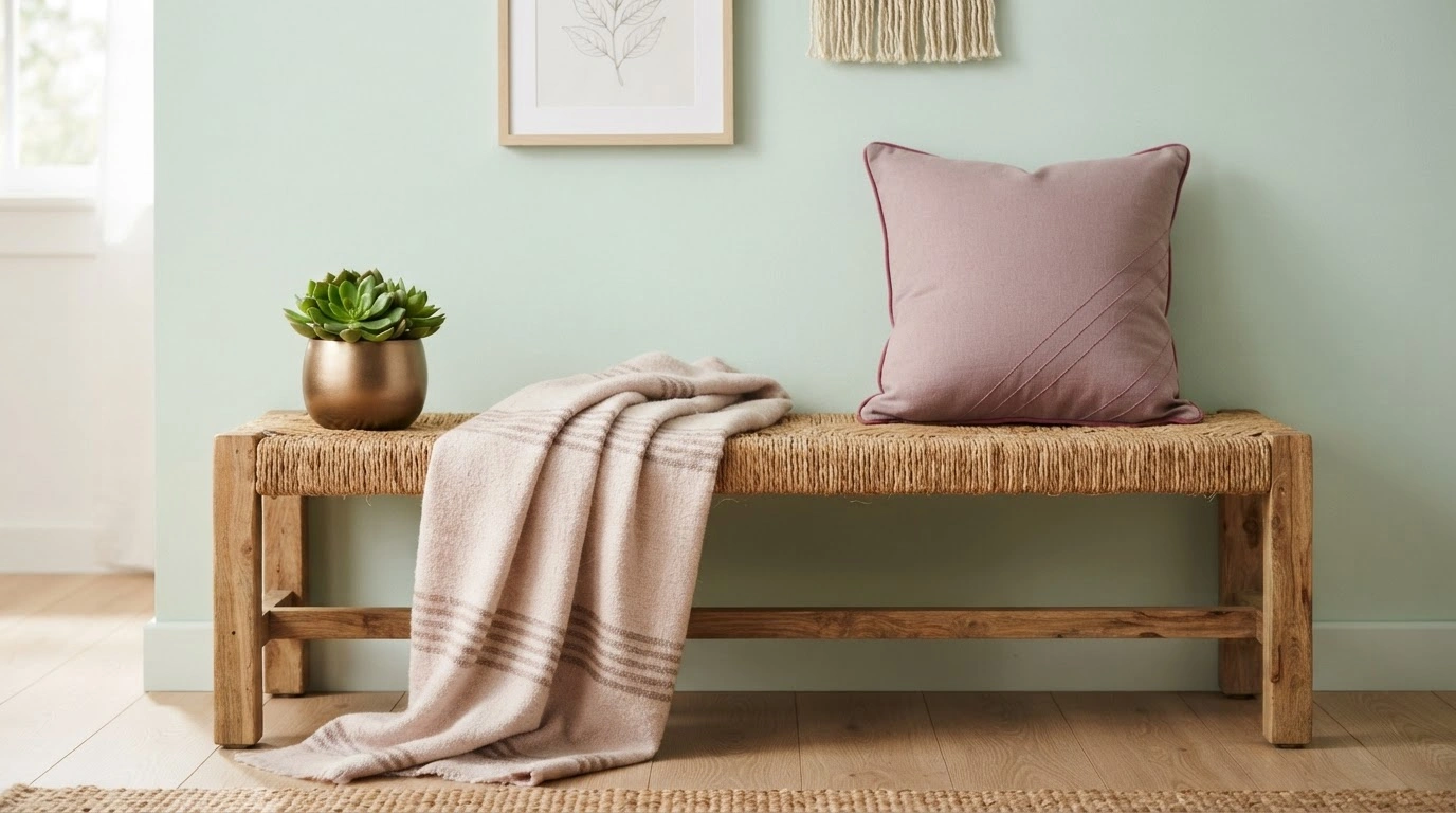
Opaline is a subtle green hue with a gray tint. This versatile shade adds a sense of calm and freshness to any room. Moreover, it is often considered a soothing shade for spaces that call for serenity, such as the bedroom, living room, or bathroom.
With its soft, calm nature, Opaline enhances a room’s natural light, making it feel larger and more spacious. Because of its neutral shade, it can also serve as a backdrop for artwork or other elements you want to highlight.
What Are the Undertones of Sherwin Williams Opaline?
Opaline by Sherwin Williams is considered versatile for its diverse undertones. Pale yellow, pale pink, mint, lilac, grey, light purple, and light blue are the primary undertones of Opaline. These undertones make Opaline versatile and suitable for almost every style. For example, under artificial light, the pink and yellow undertones are highlighted, creating a cozy atmosphere. As a result, the shade changes with the light and colors in the surroundings. This adaptability makes it a great choice for almost every room and setup.
How Does Sherwin Williams Opaline Look in Different Rooms?
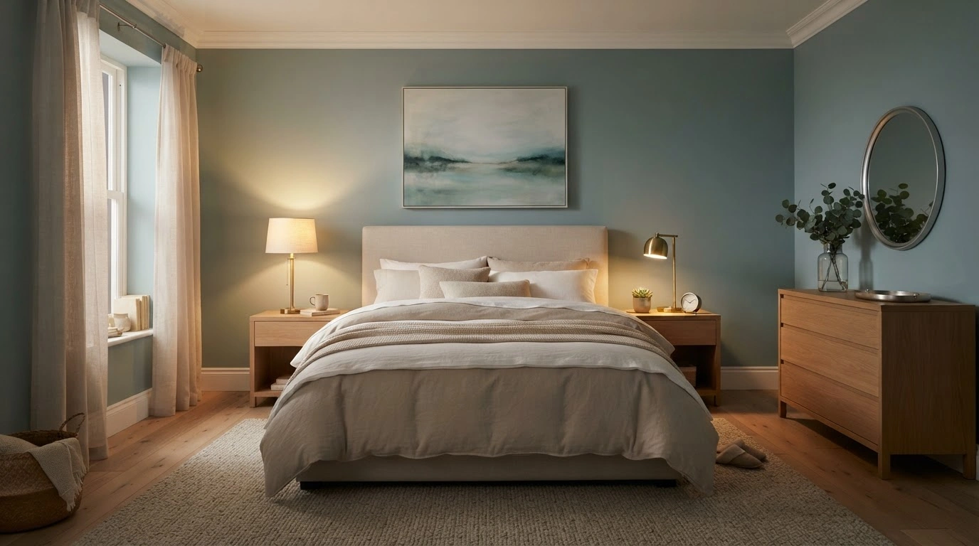
Many experts recommend this versatile shade for a variety of rooms. The best thing is that every room benefits differently from the shade.
Bedroom
The blue and green undertones of the shade create a relaxed and soothing atmosphere in the bedroom. Also, it makes the room appear much larger and more open than it is. It is known for its adaptability to different lighting, the color fills the room with freshness during daytime, while in the evening, it creates cozy vibes. The inclusion of natural wood furniture, soft bedding, and brass or silver accents enhances the coziness of the room.
Bathroom
Apart from making the bathroom appear larger in size, the Opaline shade also complements the white fixtures in the bathroom well. Hiding watermarks, the shade creates a Spa-like fresh feeling. The Opaline background will let your glass shower doors, nickel or chrome hardware, and white porcelain fixtures be the focal point.
Living Room
The versatility of Opaline color creates interest in the living room, and it is also compatible with other decor styles. While this shade goes perfectly with both dark and light furniture, wood accent fixtures, and textured fabrics, it also allows other furniture and artifacts to get attention.
Kitchen
Opaline creates a fresh environment in the kitchen, complementing well with natural wood or white cabinets. The shade also reflects enough light to make the kitchen area brighter for functionality.
Which Colors Coordinate With Sherwin Williams Opaline?
The gentle Opaline shade goes well with a wide range of shades. However, here are some popular colors that coordinate best.
Pure White (SW 7005)
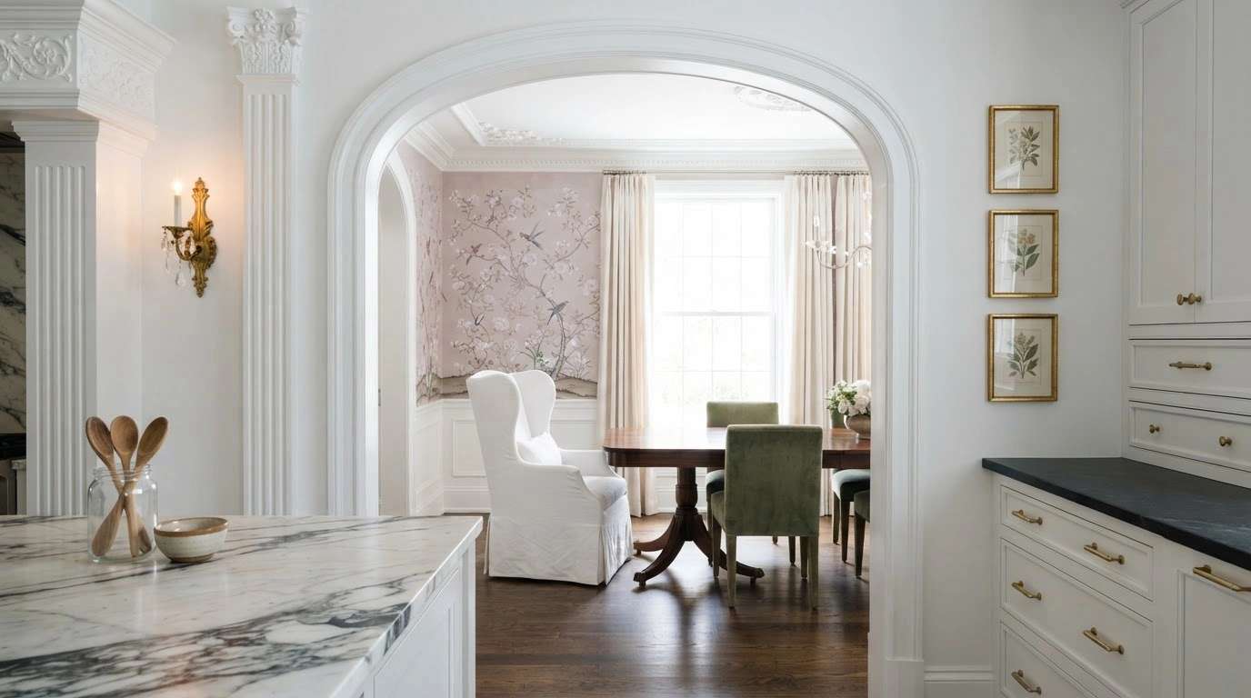
It contrasts with Opaline to offer a fresh appearance, making the combination perfect for doorways, windows, and baseboards.
Naval (SW 6244)
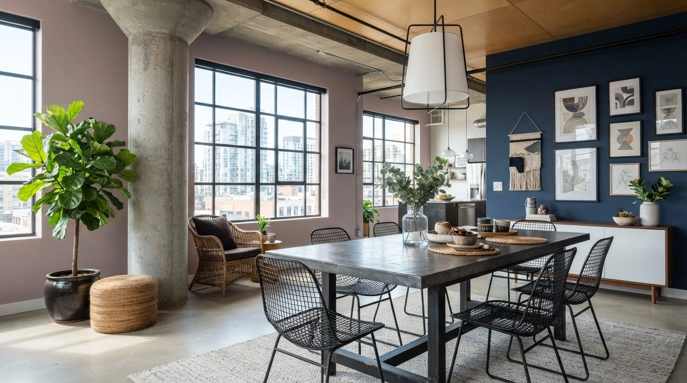
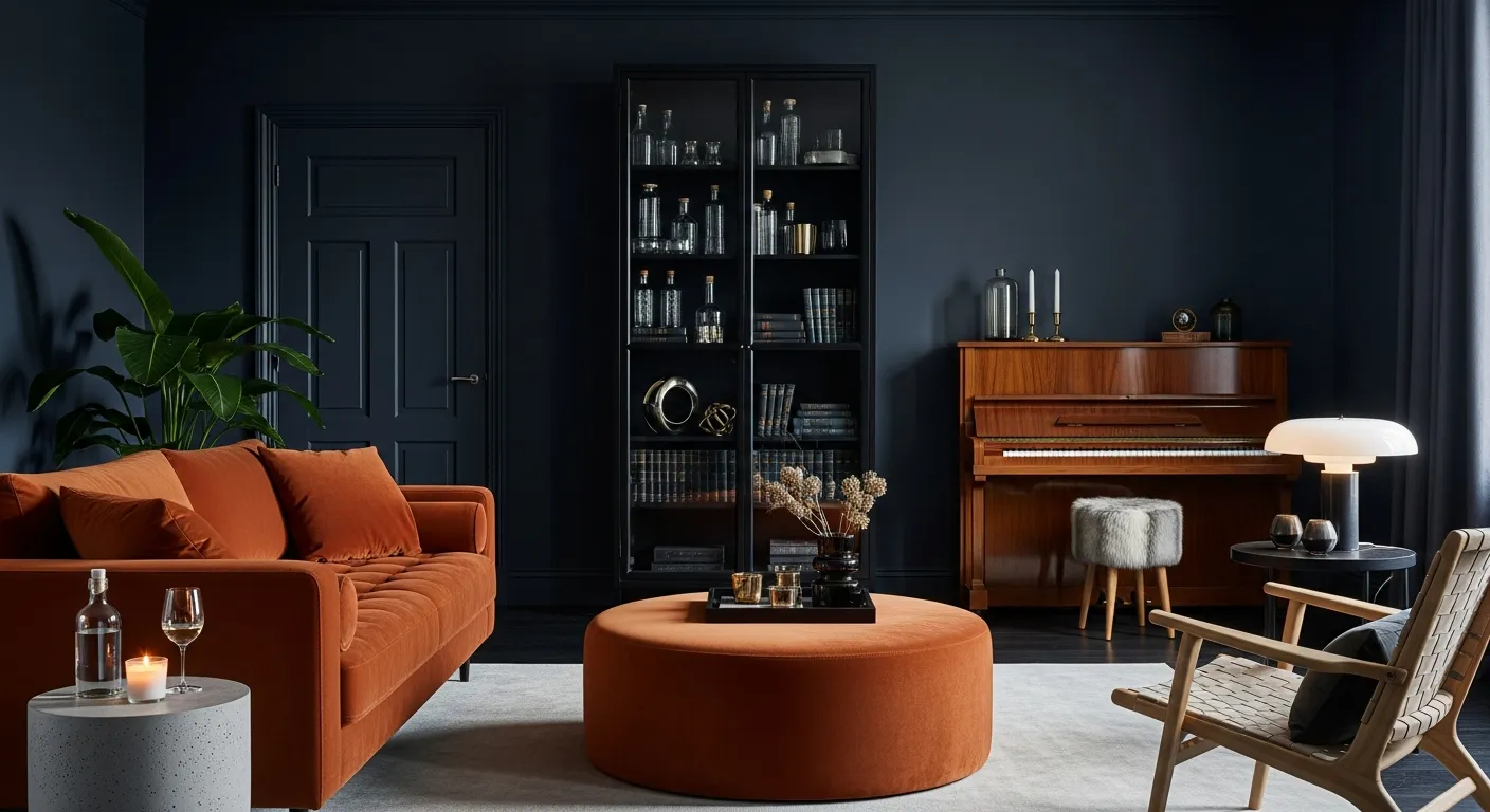
The dark blue shade contrasts strikingly with the neutral Opaline shade. Furniture in a naval hue creates depth in a living room with Opaline walls.
Rookwood Clay (SW 2823)
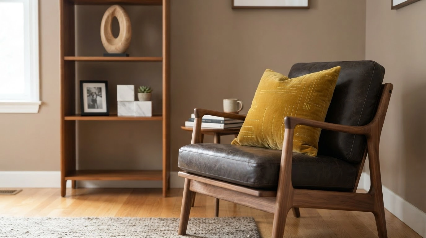
The clay-toned shade combines with Opaline to create an earthy environment. Furniture in the Rookwood Clay shade in a room with Opaline walls brings in a natural warmth.
Accessible Beige (SW 7036)
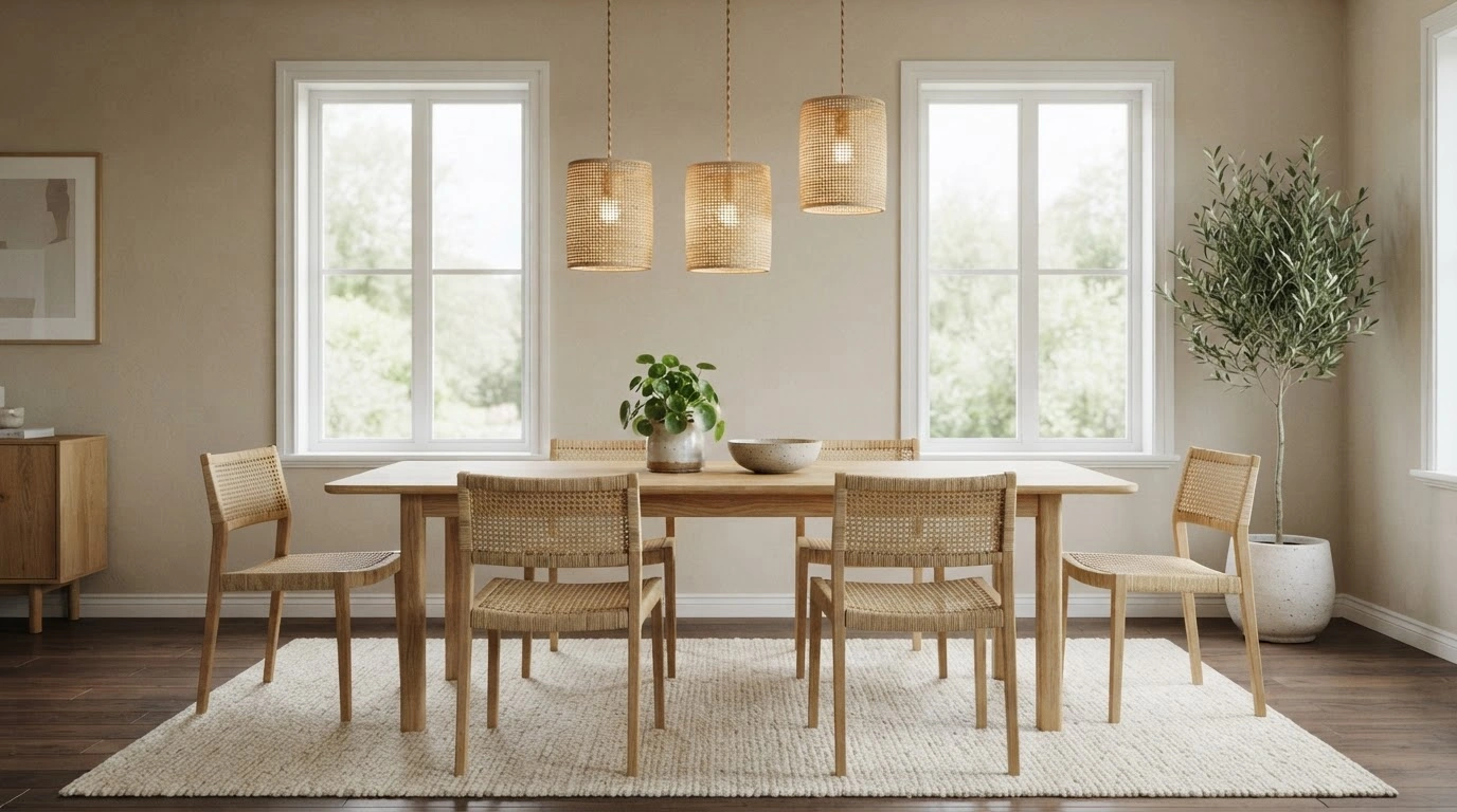
While other colors dominate the neutral Opaline shade, with accessible beige, it is the other way round. Accessible Beige provides a perfect platform for Opaline to get all the focus. However, both are neutral shades and complement each other for connected rooms.
Autumn Orchid (SW 9157)
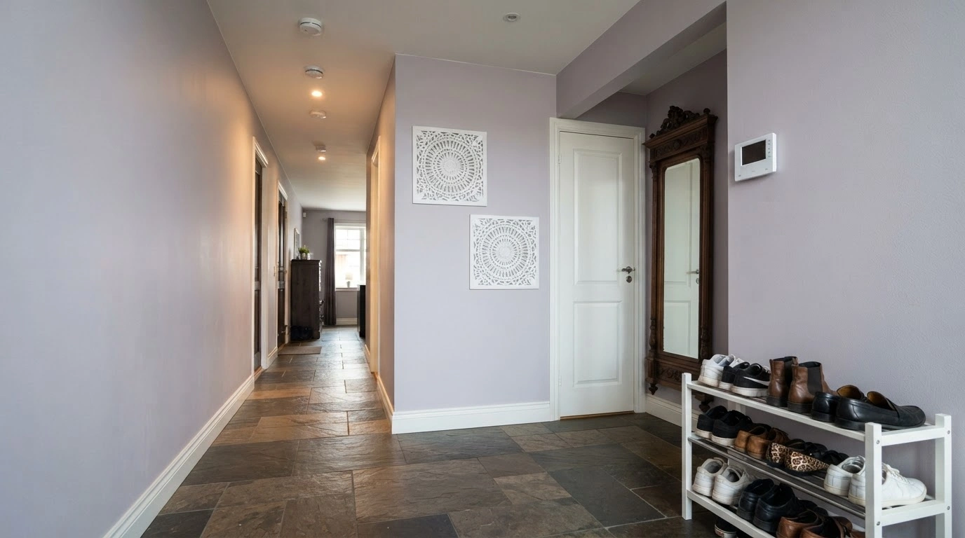
When you want a touch of another soft yet a little more prominent shade with Opaline, Autumn Orchid is the best pick with its light purple hue. Add this shade to your accent walls or get accessories like vases and throw pillows in Autumn Orchid while keeping the Opaline backdrop.
Green Earth (SW 7748)
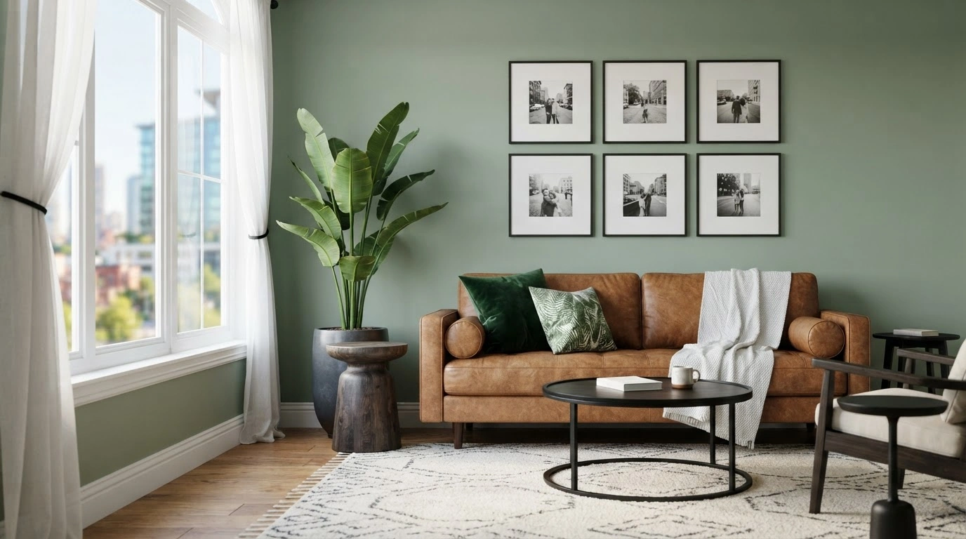
It offers a natural feel to the Opaline shade with its green hue. Similar to Autumn Orchid, you can try out Green Earth on your accent walls or furniture in an Opaline room.
How Does Light Impact Sherwin Williams Opaline?
Due to various undertones of Opaline, it shows different results in different light settings. Hence, you must understand the variations before painting your walls in Opaline.
Natural Daylight
Opaline reveals blue undertones in direct sunlight and makes your room appear calm and fresh. However, natural daylight coming from different window directions also impacts its appearance. For example, north-facing windows will bring out the gentle and gray undertones, while east- and west-facing windows will showcase the balanced blue-green undertone of the shade. The seasonal light also plays a major role, as the shade looks more vibrant in summer and cooler in winter.
Evening Light
With the dimming of the bright daylight, the gray undertones of Opaline take over, creating a cozy setup. Mysteriously, the shade reflects a silvery effect at certain angles at night, creating an interesting dimension for living rooms and bedrooms. Also, with partial light, you can notice gentle shadow gradients.
Artificial Lighting
The kind of artificial light in your house also impacts the Opaline’s appearance. It showcases the crisp and clean blue-green undertone when exposed to white LED bulbs, while warm bulbs bring out its green and gray undertones. Moreover, cool bulbs focus on the blue tones, while warm bulbs highlight the green shade. You can also create the desired impact with the placement of artificial light. Install overhead light for a brighter environment. On the other hand, place table lamps or floor lighting to create dramatic shadowy play.
What Design Styles Pair Well With Sherwin Williams Opaline?
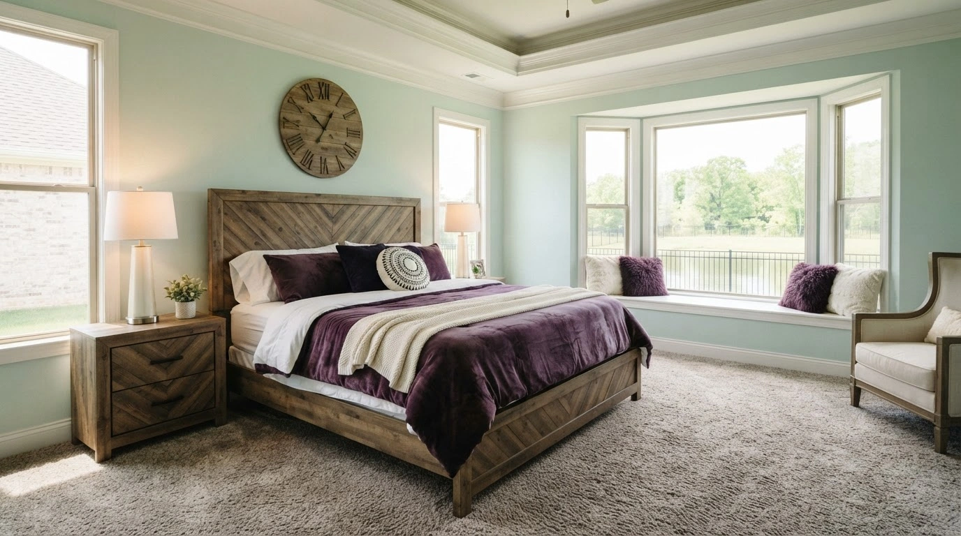
The soft tone of Opaline by Sherwin Williams creates a peaceful and airy mood in any room. As a result, it pairs well with different design styles.
Country Houses and Coastal Designs
The soft green and blue undertones of Opaline mimic the ocean and make it a natural pick for coastal design. You can pair the shade with white trim for a crisp appearance. Similarly, use textured elements like soft cottons and light linen for a relaxed feel.
The Modern Style
The gentle neutral shade works well with the vintage style. Rustic wood elements and nickel hardware complement the Opaline walls effortlessly and add a touch of sophistication.
Scandinavian Minimalist Style
The gray undertone of the Opaline shade is exaggerated in the bright open spaces and glass accents of the Scandinavian setup. Metal accents and white walls are a great match with the Opaline hue.
Traditional Style
The Opaline color offers a classic touch to your room through cabinets and other elements without overpowering.
Conclusion
The neutral shade Opaline by Sherwin Williams with diverse undertones, is a popular color that many experts suggest for different spaces in the house. It reflects different undertones under different lighting, so you can choose the shade according to your mood. While Opaline can create a clean and spacious appearance in the living room, at the same time, it creates a cozy atmosphere in the bedroom. The idea here is to understand its nature when painting your walls with Sherwin Williams Opaline.