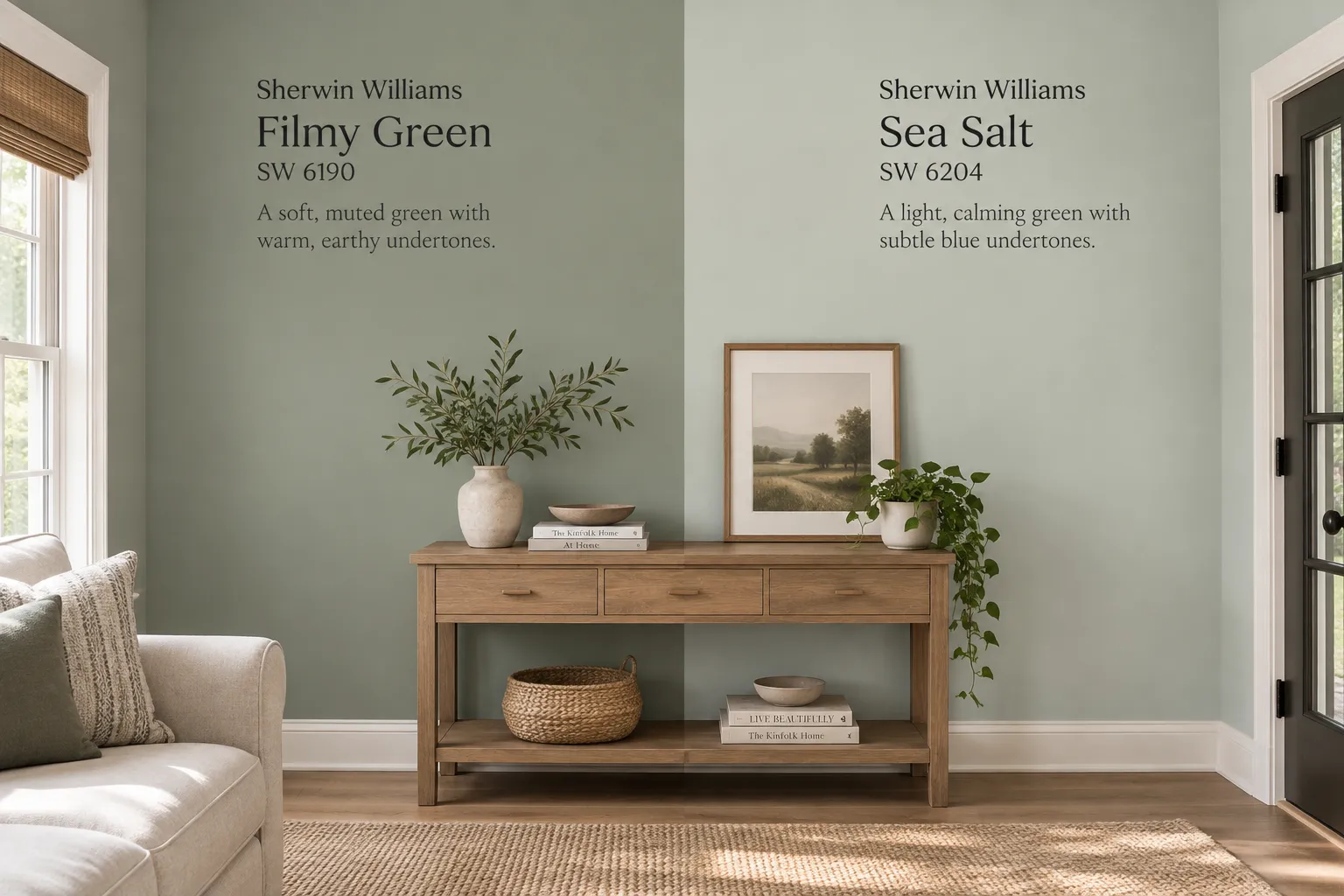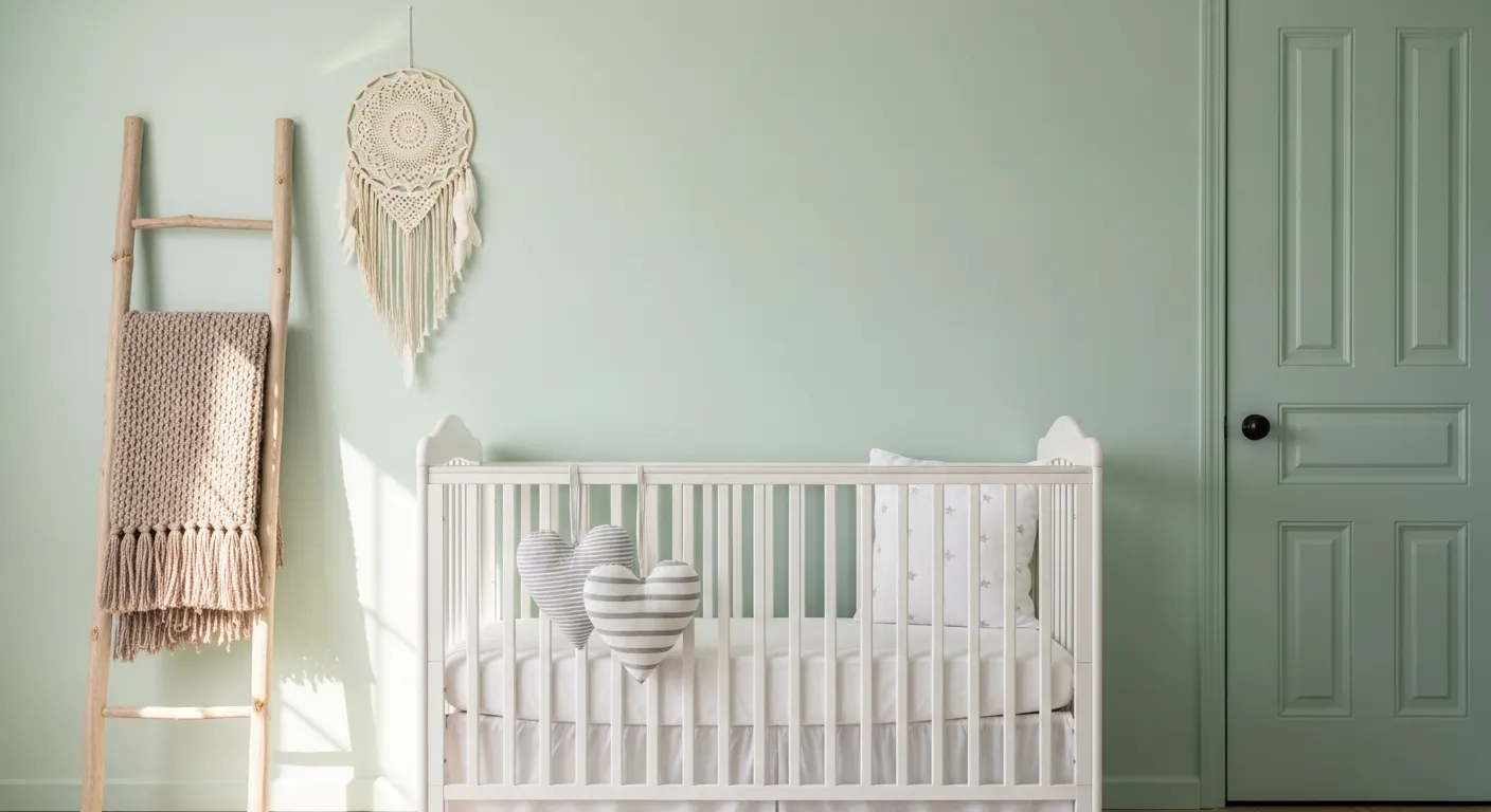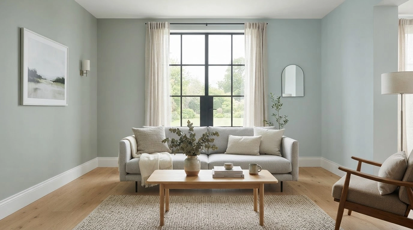
Homeowners often enquire about this comparison between “Sherwin Williams vs Sea Salt” more than almost any other query on the site. After covering Opaline on its own and putting Filmy Green up against Sea Salt in an earlier comparison, readers kept asking how these two stack up directly, and what to put in the room once the walls are done. I taped 12x12 samples of both on the same wall in my dining room, a north-facing room with one large window, and lived with them for three weeks, moving rugs and furniture in and out to see how things look against the sample paint.
What is Opaline?
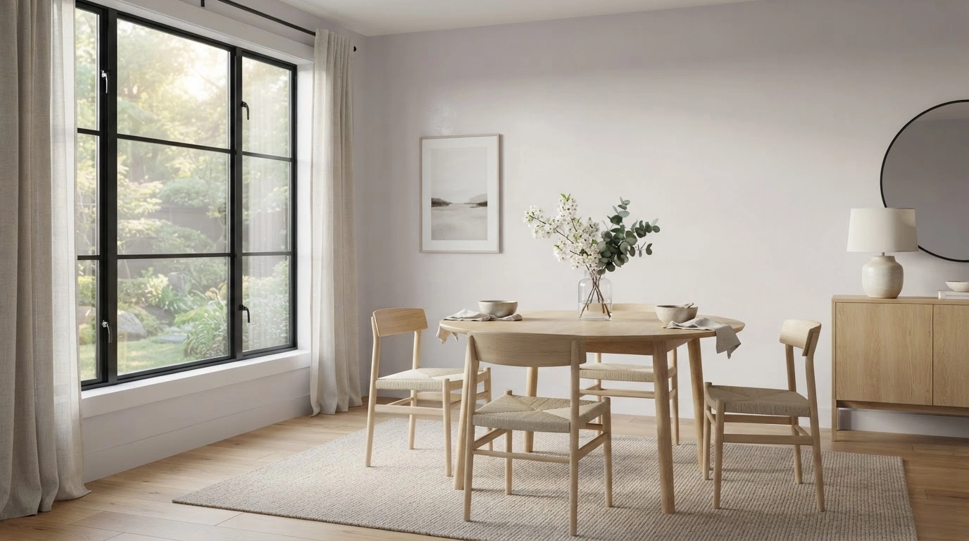
Opaline (SW 6189) is a pale, chameleon color with a hex code of #DCDFD7 and an LRV of about 73. That's high enough to read almost as an off-white in strong daylight, which is why Sherwin-Williams files it under both its blue and pastel families instead of committing it to one hue. Opaline is often used to bring in a pop of calmness and softness within the home. In my dining room, it picked up a soft lilac-gray cast in the morning and settled into a faint, cooler green by late afternoon.
What is Sea Salt?
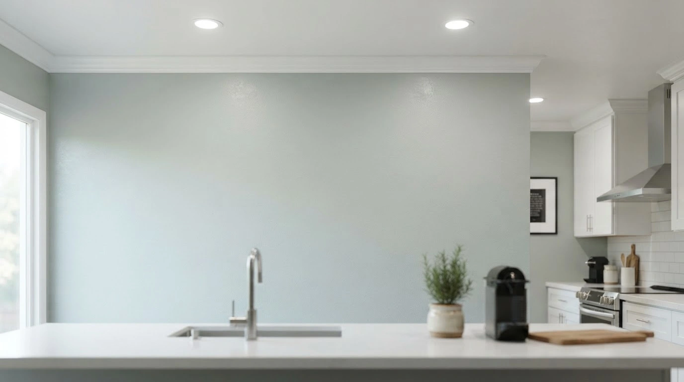
Sea Salt (SW 6204) sits ten LRV points darker at 63, with a hex code of #CDD2CA. It's the same misty, hard-to-pin-down family as Opaline, but with more gray weight and less light bounce. Under my kitchen's LED can lights, it read distinctly blue by midday and drifted toward sage by evening, the same shift I saw when I tested it against Filmy Green in that earlier comparison. If you've already sampled that pairing, you'll recognize the pattern here.
Opaline vs Sea Salt: The Real Difference
On a paint chip, a 10-point LRV gap and similar undertones make these look like near-twins. In an actual room, they behave differently. Opaline stayed close to a warm white most of the day in my north-facing dining room and only showed real color near dusk.
Sea Salt held its gray-green identity all day, because it doesn't have the LRV headroom to bleach out under weak light. Opaline can look flat in rooms that don't get much sun, while Sea Salt can turn dark and muddy in a small, windowless bathroom, something the styled marketing photos rarely show.
A Quick Comparison Between Opaline and Sea Salt
| Criterion | Opaline | Sea Salt |
| Hex Code | #DCDFD7 | #CDD2CA |
| Shift in the color during different time of the day. | Warm white during the daytime. | Gray-green throughout the day. |
| LRV | 73 | 63 |
Where Each Color Works Best?
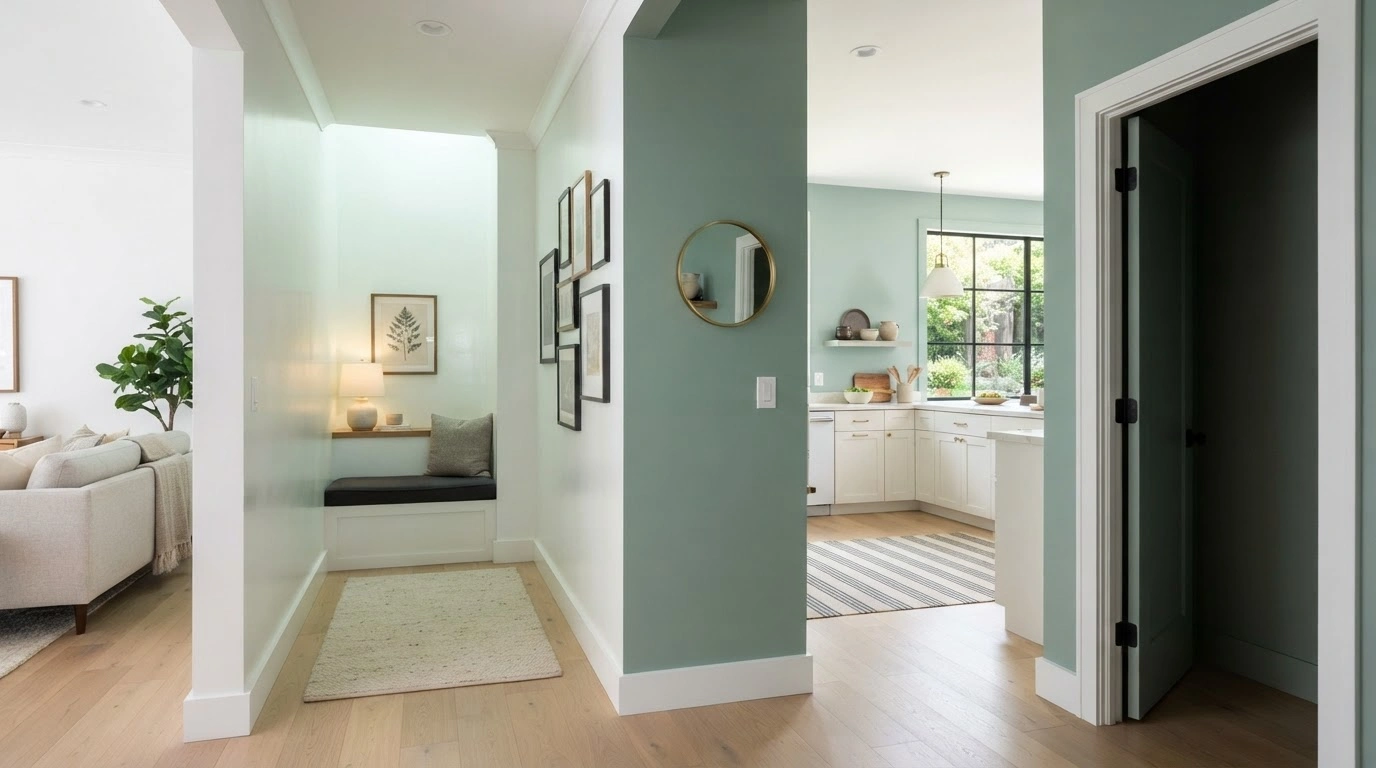
Opaline works best for small or dim rooms, hallways, and trim-adjacent walls where you want brightness without stark white. It's also suitable for open floor plans, since its high LRV won't fight with adjoining rooms painted true white.
Sea Salt earns its reputation in bathrooms, kitchens, and entryways that get decent daylight, where its deeper base can carry a room on its own instead of leaning on an accent wall to do the work. I would not put it in a windowless powder room. I tried that in a client project last year, and without daylight hitting it, the color went flat and dingy within a day, closer to old dishwater than the fresh gray-green it shows in a lit room.
| Some Tips |
If you want a color with a more assertive green presence than either of these, Sherwin-Williams Filmy Green is worth a look before you decide. |
Trim and Cabinet Pairings
Both colors trim out well with Pure White (SW 7005), which is what I used on the baseboards, so the wall color did the talking. Past that, they split.
Opaline looked best next to black iron hardware and unlacquered brass, the kind of combo you'd see in a coastal Charleston kitchen.
Sea Salt leaned harder into warm wood tones, and it genuinely struggled next to cool gray quartz; the countertop read slightly green in a way that looked unfinished. That's the one pairing I'd sample before committing to it, since it's not something most guides mention.
Rugs, Furniture, and Decor That Work With Each
The wall color is only half the room. Once the paint's up, the rug and furniture choices are what make either shade look finished instead of half-decorated.
For Opaline, I lean into natural fiber rugs, a jute or low-pile wool in oatmeal or bone, since the wall is already pale enough that a busy or dark rug ends up competing for attention. White oak or bleached wood furniture keeps the room feeling light rather than washed out. A single deep, moody piece, a black-frame accent chair or an aged brass floor lamp, reads as intentional here, something a room full of pale wood and pale walls can start to lack without it.
Sea Salt can carry more weight. In my kitchen test, a chunky wool rug in warm ivory with a subtle stripe held its own against the wall instead of disappearing into it, which is the real risk with anything too pale or too closely matched. Walnut or a warm mid-tone wood works better here than with Opaline, since Sea Salt already carries enough gray to keep warm wood from reading orange next to it. For smaller decor, I'd stick to linen pillows, a woven seagrass basket, and unlacquered brass or aged bronze over anything glossy or heavily patterned, since Sea Salt's undertone already shifts enough on its own without a busy print layered on top.
One thing I'd skip with either color: stark white accents, like bright white ceramics or crisp white pillows. Both colors read as slightly aged, misty neutrals, and a pure white piece set right next to them can make the wall look dingy by comparison. I didn't notice this until I set a white vase on an Opaline-painted shelf and the wall behind it suddenly looked like it needed a fresh coat, when nothing about the paint had changed.
My Pick
If I had to choose one for a whole-house neutral, I would go with Sea Salt. Opaline is lovely, but in anything short of bright, consistent daylight it can end up looking like a paint mistake, an off-white that didn't quite take. Sea Salt takes more thought, since it can lean cold in north light and needs a warm rug or wood tone to balance it, but it pays that effort back with a color that reads as intentional rather than accidental.